My general feelings towards AI are very mixed. I think over time it’ll lead to decreased creative and critical thinking skills, but in the short-term, I’m really enjoying using it creatively. The most recent use of which was when I needed a free logo designed.
This isn’t the first time I’ve tried to design a logo using AI. About one year ago I gave it a go and it was completely unusable, but AI has come a long way since then.
Why don’t you just use a graphic designer?
There’s no doubt a graphic designer will give you a high-spec logo that will stand the test of time. You’ll be given variations, be able to request changes, and have workable files that you can use whether it’s a website favicon or a billboard ad.
But sometimes, you don’t need a perfect logo, you just need a logo—that was the situation I was in. I was wanting to sketch out a concept for a business, get a feel for it, live in it a bit, without committing myself to it. I needed something quick and fast, but I also wanted it to be useful. Moreover, I wanted something that looked like it came from a human.
The Result
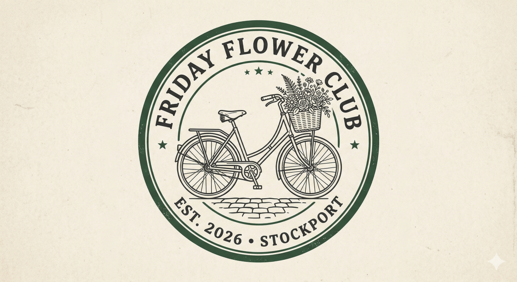
Let’s start at the end. I’ll show you the logo the AI produced and then we’ll work backwards and I’ll tell you how we got there.
The design was for a bike pop-up selling flowers. What I wanted going into this was something simple enough to reflect the simplicity of the business, yet still look high-end. I also wanted it to be high quality enough to be used on a website or social media (ideally no less than 1000px x 1000px).
How to prompt AI to give you a logo
AI is a bit like your body: if you fill it with rubbish, it won’t perform when you need it.
That said, prompt building is a skill—and it’s a skill that AI is better at than you or I. It knows what it needs to build an image. Therefore, what you should aim to do is get the AI to understand your business. I spent a while “chatting” to Gemini about my vision for this business; I used it as a bit of a sounding board for ideas and things I wasn’t quite sure of. We weren’t logo prepping at this stage; we were business planning.
When I had enough confidence in the AI, I didn’t then ask it to build me a logo. I asked it to write me a prompt to get a logo. This is what it gave me:
“A high-resolution, professional brand logo for ‘Friday Flower Club’. The design is a circular ‘heritage badge’ style. In the center is a minimalist, elegant line-drawing of a vintage Pashley delivery bicycle with a front wicker basket overflowing with small wildflower posies. The typography is a clean, modern ‘Typewriter’ or ‘Serif Heritage’ font. The words ‘FRIDAY FLOWER CLUB’ are arched over the top of the circle, and ‘EST. 2026 • STOCKPORT’ is arched along the bottom. The color palette is deep forest green, charcoal black, and a muted cream background. The overall aesthetic is rustic, artisanal, and ‘SK1’ industrial-chic. Soft, flat vector style with no complex shading.”
This is definitely a more specific prompt than I would have written, and it seemed like the AI had a very specific idea for the logo in mind. I asked it how it built the prompt to see where the idea came from.
“Can you tell me how you built out this prompt using what we spoke about? I want to know how our conversation influenced the prompt.”
Here’s what it said:
- The “Pashley” Requirement: Since we identified the Pashley bike as your primary asset, I specified a “vintage Pashley delivery bicycle” so you wouldn’t get a generic mountain bike or a modern racer.
- The “Fist-Full” Posy: We debated if 10 stems was “artisan.” I used “wildflower posies” to translate our “10-stem volume” strategy into a visual that avoids stiff, formal bouquets.
- The “Stockport Underbanks” Aesthetic: Since you mentioned the Underbanks and SK1, I added “industrial-chic” and the forest green/charcoal palette to mimic the traditional shopfronts and ironwork of Stockport.
- The “Rubber Stamp” Constraint: You mentioned using second-hand jars and wanting to keep costs low. I added “flat vector style” so the logo can be turned into a rubber stamp or a vinyl sticker for a bike crate without losing detail.
- The “Membership” Hook: As we moved to a subscription model, I chose “Typewriter” or “Serif” fonts to make the “Club” feel established yet artisanal.
The Verdict
I can’t lie, I was quite impressed. It felt like a very thought-out logo, and I actually loved the way it looked.
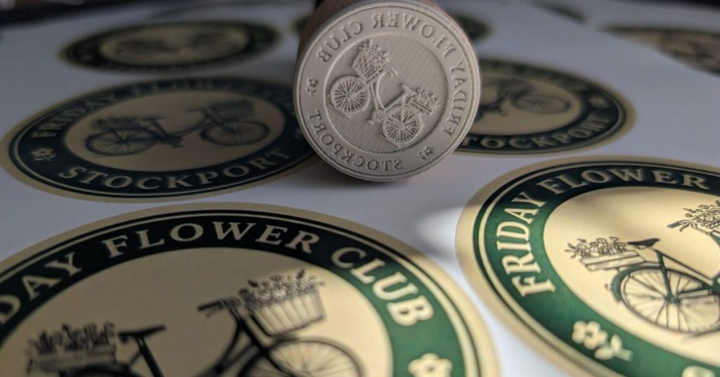
I’ve used the logo on a very cheap run of stickers, as well as a stamp and I think it looks great.
Pro tip: Temu is an excellent place to buy very cheap personalised / branded products! The stamp cost me £8.21 and 100 stickers cost me £6.72 – much cheaper than uk suppliers.
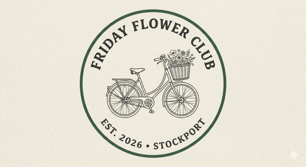
I wanted to see how much variance AI would have with the exact same prompt, so I ran it again in three separate chats. While each was slightly different, they had a clear consistency based on the prompt.
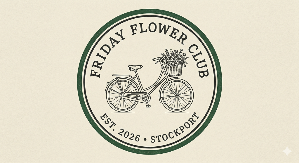
Overall, the first is still my favourite. It’s a bit of a weird feeling—worrying about what AI does to our brains while also being genuinely excited that I have a set of stamps and stickers on the way that look exactly how I imagined.
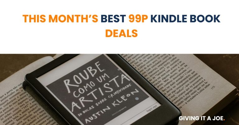
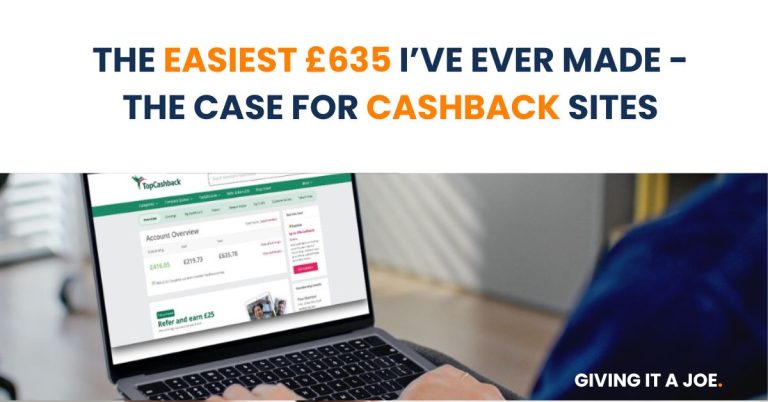
Looking for more ways to save money?
Check out this month’s 99p Kindle book deals, or the easiest £600 I’ve ever made.